Today I'm celebrating five years of blogging as I feature my Around the World quilt. I can always remember when I began Lollyquiltz because it was on my birthday.
Never did I dream that I would have friends from around the world because I'd decided to chronicle my quilt making and sewing. It's definitely been a lovely perk!
I began this quilt in a workshop taught by Shannon Brinkley, author of Scrappy Bits Applique. She was the speaker at the Kansas City Modern Quilt Guild in January. I chose to add a layer of tulle over the glued down applique and then quilted the whole thing with straight (ish) lines. This was a new-to-me technique. The other option was to applique with clear thread which my Bernina and I seem to be allergic to! This method worked out pretty well.
There ended up being a small amount of rippling in the water surrounding the continents. Oh well.....adds interest and realism, I say! The quilt still lays flat and I like the overall effect. I'm deciding, though, that maybe art quilts are really not my thing. But, I'm usually up to try any technique at least once!
This quilt will be hanging in the Kansas City Regional Quilt Festival June 19-21. Are you planning to attend? If so, let me know as I'd love to meet you "in real life"! Thanks so much for stopping by Lollyquiltz.
Showing posts with label art quilt. Show all posts
Thursday, March 12, 2015
Thursday, October 16, 2014
Welcome to Colorful Colorado
With that soft spot in my heart, it was not difficult for me to say yes to Katie when she asked if I would test her new pattern called, "Welcome to Colorful Colorado".
The 66" x 81" quilt would look great as a wall hanging or even on a twin bed. It can be viewed vertically, as if you are standing looking at a sunset behind the mountain range or horizontally, where it represents the plains, mountains, and mesas of the state of Colorado.
Because of the many pieces and the angles that need to be cut to make the design, the pattern is best suited to intermediate or advanced quilters. With accurate seam allowances and good labeling of the pieces, this makes for a fun project, though, once the cutting is finished. It's like putting together a puzzle!
Welcome to Colorful Colorado is available for download on Craftsy. You can find it here.
The cutting is straightforward and easily achieved by following the clear directions. Katie has included tips for sewing everything together successfully as well as some quilting ideas that can be achieved on your home sewing machine. (I haven't gotten to that quilting part yet, as you can see.)
The quilt really is like a piece of art and I'm looking forward to seeing mine hung on a wall! If you love working with solid fabrics, this might just be an idea for your next project. I used Kona but Katie's version is lovely using Oakshot Cottons.
Friday, August 1, 2014
Town and Country: An Art Quilt About Contrasts
Green is such a refreshing color, don't you think.
Traveling the highways of America, we see the nourishing green that water brings to the earth through the irrigation of farmland.Much like a patchwork quilt, when viewed from afar, our continent and world is ripe with patches of emerald wherever water has touched.
Driving along suburban boulevards, we see man's attempt to bring that refreshing vegetation into his world as he has made his home in towns and cities.
Small towns, baking in the heat of summer, create relief with the planting of shade trees wherever there is space.
Big cities must try even harder to provide the contrast of green within its concrete boundaries.
This quarter's Four-in-Art challenge was to create a 12" square quilt depicting "Contrast" as it relates to the overall theme of "Urban".
Struggling a little with this challenge subject, I ended up making my simplest design of the four quilts so far. As I tossed around ideas, the contrast of rural nature and man made concrete kept coming back to me.
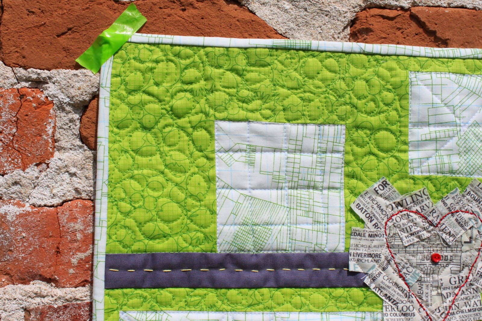
Beginning with the same Architexture fabric that I had used in the previous challenge quilts, I pieced some simple rectangles to represent towns and suburbs across America.
A strip of Kona coal became a highway by adding some hand stitched dashes of yellow crewel embroidery thread.
Finding two charm squares of the city names fabric, I cut one into little squares and stitched them down to create a sort of heart shape along the highway. The frayed edges represent the many people living within the cities' limits. The red hand stitched heart and button is the pulse of the city. Getting out of the city into the natural "green" world surrounding busy streets brings refreshment to the soul.
The backing on my quilt is a remnant of another script fabric listing beaches around the world. When I'd almost finished the quilting, I turned over the quilt and realized that I'd laid the backing fabric upside down! Oh, well.
A year ago, at the beginning of this Urban challenge, I decided to make my quilts go together as a set so that they could all be hung together. I used some of the same fabrics and colors in each quilt. I'm not sure how well this latest Contrasts quilt fits in with the style of the other three, though.
The leader of our art quilt bee has proposed that we make one more quilt with the Urban topic so that the next topic will begin with the calendar year. I'm a little bummed about that because 5 quilts won't fit together so neatly. (I may have to make my own rule about the size of the next one so that it plays nicely with the others!)
Here's one last shot of my Town and Country quilt hung on a crumbling urban wall. See the list below for more quilted creations in the Four-in-Art Urban Contrast Challenge.
Amanda at whatthebobbin.com
Anne at springleafstudios.com
Betty at a Flickr site: http://www.flickr.com
Carla at lollyquiltz.blogspot.com
Elizabeth at opquilt.com
Leanne at shecanquilt.ca
Nancy at patchworkbreeze.blogspot.com
Rachel at rachel-thelifeofriley.blogspot.com
Thursday, May 1, 2014
My Landmark Quilt
Today is Reveal Day for the Four-in-Art Bee. My quilt is the third in a series around the main theme of Urban. Our topic this round was Landmark.
Being a directionally-challenged girl, whenever someone asks me for directions to my house I always say the same thing: "Do you know where Johnson Farms is?" Johnson Farms is a wonderful garden center and nursery just down the road from my house. Most of the plants they sell at this family business are grown from seeds in their nursery.
After thinking about several options to convey the idea of "landmark" I finally, decided to create a quilt that reflects a landmark that I use constantly. The sunflower windmill represents all of their gorgeous flowers. In the fall, the garden center turns into a wonderful Pumpkin Farm: one we have visited many times with our grandchildren!
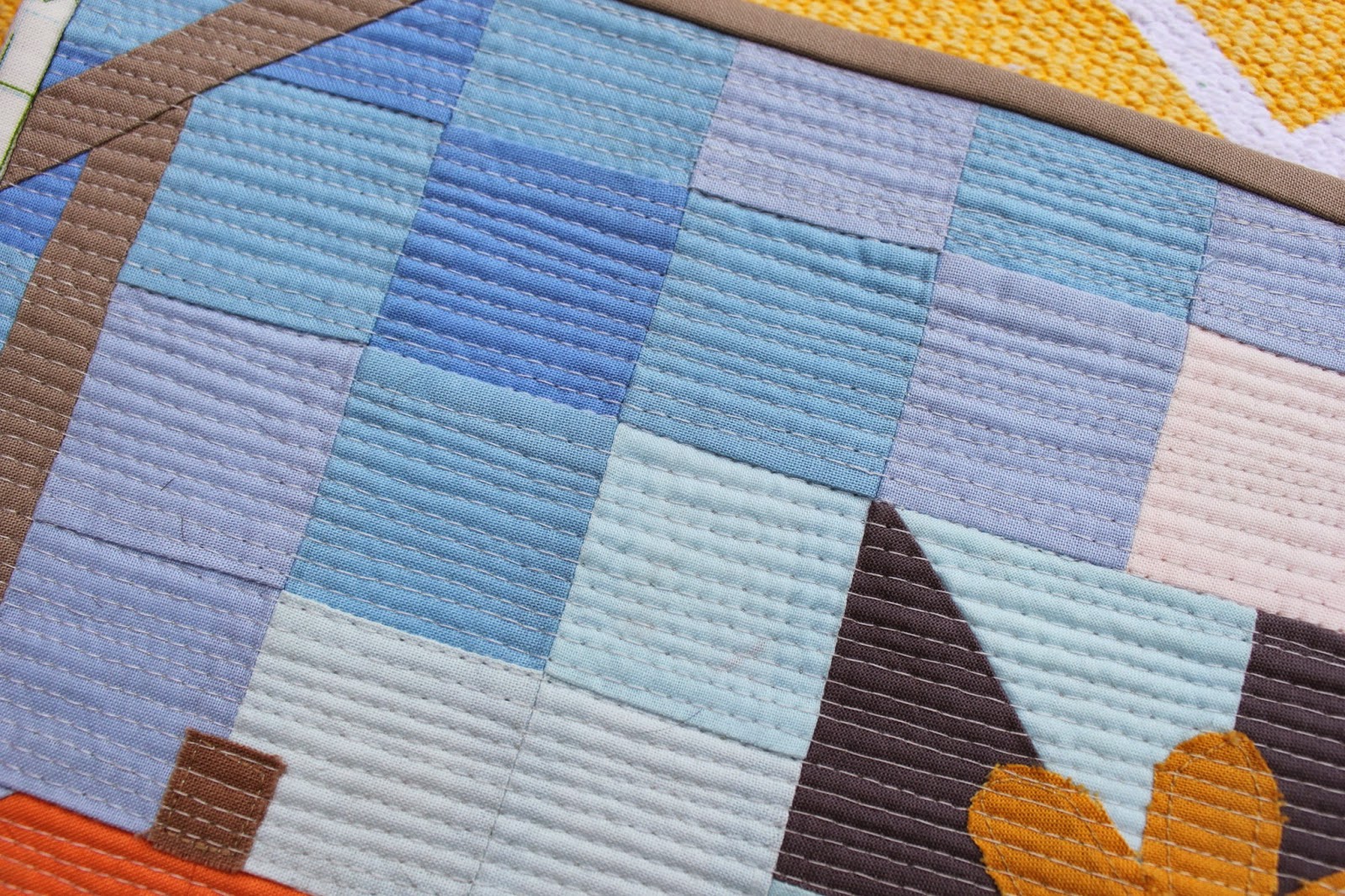
From the start, I knew that I wanted to keep the fabrics in this third quilt in the same color range as the first two for consistency. Many of the pastel solids and the grey are actually cut from the same cloth as my first two Urban quilts, seen here and here.I chose to make the background sort of a mosaic using two inch squares. Then I inserted a pinwheel block to represent the sunflower windmill and an orange hexagon to stand in for the pumpkin.
After piecing the quilt all together, I added a raw edge applique sunflower, windmill derrick, pumpkin stem and tiny pink squares for flowers. My walking foot easily stitched over the little glued-on squares.
I wanted to somehow depict the barn shaped roof of the Farm sign, so, after piecing in the sides of the barn and the angles, I used the binding to convey a roof by piecing in a length of taupe fabric to match. The remainder of the Architextures binding matches the first two quilts in the series.
I tried to keep my matchstick quilting as straight as possible but toward the edges, I got a bit off. I love the texture that the quilting added to this piece of art.
Because the quilt is only twelve inches square, the stitching went fast. I doubt I would have the patience to tackle this style of quilting on a larger piece!
The backing on this little quilt is from the True Colors line by Heather Bailey.
I'm pretty pleased with my representation of a landmark in my life. I might even get brave and take it over to Johnson Farms sometime and see if they recognize it!
Making little art quilts has been a new experience for me; one that I've enjoyed. I invite you to take a few minutes and check out the landmark quilts made by the other seven quilters in the Four-in-Art Bee. The links are listed below.
Anne at springleafstudios.comBetty at a Flickr site: http://www.flickr.com/photos/toot2Carla at lollyquiltz.blogspot.comLeanne at shecanquilt.caNancy at patchworkbreeze.blogspot.comRachel at rachel-thelifeofriley.blogspot.com
Saturday, February 1, 2014
Urban Crosses: Four-in-Art Art Quilt #2
The topic for the second entry in the Four-in-Art Challenge is Structure. There are eight quilters in this group and we each have made a 12 inch mini art quilt around this theme. The overall yearly theme is Urban. Here is my entry...
Since I always enjoy spotting steeples and church crosses in every town and city that I visit, they seemed the perfect choice to depict in art quilt form. Living in Kansas City, we have a particularly unusual steeple of light coming from the top of the Community Christian Church on the Country Club Plaza. Outside the church, designed by Frank Lloyd Wright, stands a wonderful cross monument. (The photo below is taken from tourist information published by the city.) I've decided that I would like to try to have all four of the quilts that I'll be making for this challenge blend together as a set. With that constant in mind, many of the fabrics that were used to make Urban Crosses are repeats from my first entry, Flying South, which was a depiction of the word Maps.
Wanting to somehow represent light, I landed on using the Drunkard's Path block to simulate the spotlights coming from the top the church. The map-like fabric in several of the blocks references city streets.
My quilting lines radiate from one spot, again, to imitate the light coming off the church. I chose to only make 3 crosses to represent the beautiful monument in the photo above. I found this cute city streets fabric in my stash to use for the back of the quilt with the map-like fabric as binding.
The dark grey strip in the center might represent a street. I'm so clever!
Piecing the quilt was an enjoyable experience once I finally decided on a theme. The one darker peach piece is a bit out of place maybe, but I've decided that it reminds me of a sunset or the Holy Spirit with the placement above the center cross.
It was a stormy day when I stopped outside the church and snapped this picture of the crosses. The steeple light is visible only at night, of course. The cross symbol is an important one in my life as well as to many living in urban and rural settings everywhere.
Take a look at the other seven Urban Structures entries here: http://www.flickr.com/groups/2044432@N25/
You also might like to visit each participant's blog site to learn more details of how each was made. Grab a cup of tea and join me!
Amanda Kattner--ajkattner@yahoo.com, blogs at: http://www.whatthebobbin.com
Anne Deister--anne@springleafstudios.com, blogs at: http://www.springleafstudios.com
Nancy Myers--retiredandquilting@gmail.com, blogs at: http://www.patchworkbreeze.blogspot.com
Elizabeth Eastmond opquilt@gmail.com blog: www.opquilt.com
Betty Ayers--b78ayers@comcast.net // no blog, but a Flickr site: http://www.flickr.com/photos/toot2/with/8892547999/
Rachel Riley--rsriley77@gmail.com, blogs at: http://rachel-thelifeofriley.blogspot.com
Leanne--shecanquilt@gmail.com, blogs at: http://shecanquilt.blogspot.com
Subscribe to:
Posts (Atom)