Green is such a refreshing color, don't you think.
Traveling the highways of America, we see the nourishing green that water brings to the earth through the irrigation of farmland.
Much like a patchwork quilt, when viewed from afar, our continent and world is ripe with patches of emerald wherever water has touched.
Driving along suburban boulevards, we see man's attempt to bring that refreshing vegetation into his world as he has made his home in towns and cities.
Small towns, baking in the heat of summer, create relief with the planting of shade trees wherever there is space.
Big cities must try even harder to provide the contrast of green within its concrete boundaries.
This quarter's Four-in-Art challenge was to create a 12" square quilt depicting "Contrast" as it relates to the overall theme of "Urban".
Struggling a little with this challenge subject, I ended up making my simplest design of the four quilts so far. As I tossed around ideas, the contrast of rural nature and man made concrete kept coming back to me.
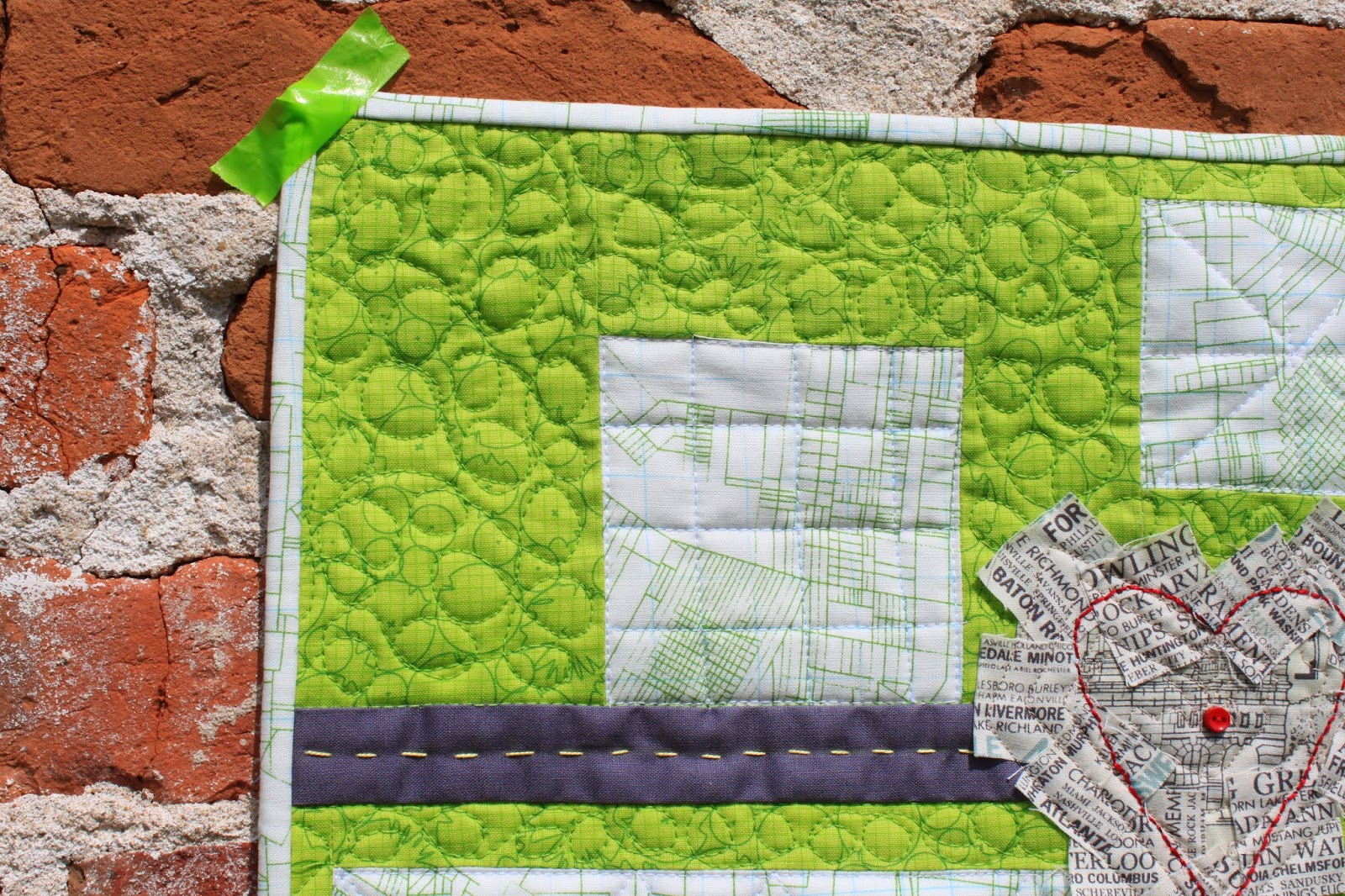
Beginning with the same Architexture fabric that I had used in the previous challenge quilts, I pieced some simple rectangles to represent towns and suburbs across America.
A strip of Kona coal became a highway by adding some hand stitched dashes of yellow crewel embroidery thread.
Finding two charm squares of the city names fabric, I cut one into little squares and stitched them down to create a sort of heart shape along the highway. The frayed edges represent the many people living within the cities' limits. The red hand stitched heart and button is the pulse of the city. Getting out of the city into the natural "green" world surrounding busy streets brings refreshment to the soul.
The backing on my quilt is a remnant of another script fabric listing beaches around the world. When I'd almost finished the quilting, I turned over the quilt and realized that I'd laid the backing fabric upside down! Oh, well.
A year ago, at the beginning of this Urban challenge, I decided to make my quilts go together as a set so that they could all be hung together. I used some of the same fabrics and colors in each quilt. I'm not sure how well this latest Contrasts quilt fits in with the style of the other three, though.
The leader of our art quilt bee has proposed that we make one more quilt with the Urban topic so that the next topic will begin with the calendar year. I'm a little bummed about that because 5 quilts won't fit together so neatly. (I may have to make my own rule about the size of the next one so that it plays nicely with the others!)
Here's one last shot of my Town and Country quilt hung on a crumbling urban wall. See the list below for more quilted creations in the Four-in-Art Urban Contrast Challenge.


I think your interpretation is very interesting. I especially like the heart as the pulse of the city! Be a rebel and make #5 a long narrow mini!
ReplyDeleteI love the heart of the city and that you used text-y prints there. The hand stitching and the button are such great details. I love this little quilt.
ReplyDeleteI enjoyed your commentary and really really like your quilt
ReplyDeleteThis mini is so inspiring. The color is wonderful. I really like the way your quilts all fit together. I love that last photo where your tape is tucked into the hole in the wall. Don't know if you planned it, but I like it!
ReplyDeleteYour thoughts on the topic of urban contrast are great. I think you did a wonderful job showing that in your piece. I think it works together well with the others. I hope you will be able to fit the 5th one into the group so they all work well together.
ReplyDeleteSuch a nice story behind your mini. Looking so closely at the green is a wonderful way to interpret the theme. We do try hard to bring nature into the urban setting through green don't we? Thankfully there are parks in big cities or I'd never really feel comfortable. I think you and I are country girls at heart.
ReplyDeleteLove your interpretation! And I agree with you....break the rules! A fifth in a size to fit with the others would be great!
ReplyDeleteBeautiful photographs supporting the quilt story! I just had a week of traveling from rural Michigan to Boston to the lakes and mountains of New Hampshire. The contrast in the nature and amount of natural green was as you describe.
ReplyDeleteI think your take on this one is the best yet, spot on! How you thought it through, the use of Architexture and Kona and all the cities in a heart, just perfect. Great job!
ReplyDeleteI really enjoyed reading this post, your thoughts and how you arrived at this quilt. Interestingly, we normally have lots of trees in shopping center parking lots, little spots of shade since it is so hot here in the summer. The other day I went to Target and thought something looked different--they had cut down half of the trees! I'm not sure if it was due to disease or drought, but it certainly increased the heat level visually, if not actually.
ReplyDeleteThis challenge is far too challenging for me! I like the heart in the city, as even though I am a farmer's daughter, my heart is in the city.
ReplyDeleteThanks for sharing your quilt and photos of the Kansas City area. I'd recognize those median-divided boulevards anywhere!
ReplyDeleteI like this little quilt a lot. The photos and story add so much to it, which is so true of most art quilts, I think. The Architextures fabric is perfect for the city and country contrast. And the text with cities, perfect!
ReplyDelete(I just wrote a long comment, but it didn't publish, so I'll try it again.)
ReplyDeleteMy daughter and her three kids were here during the challenge reveal, so I'm just now finishing up seeing everyone's creation. I love your ideas about green and cities and one being a contrast to each. Your photos that go along with your explanations do your ideas justice. I love this little quilt, with its patches of green and cities and the road that connects them both. I also like that wild patchworky heart and the neat embroidery that provides a boundary for that imaginary city. This is a terrific little quilt, Carla!
Well done Carla!!! I love the story behind your quilt making, and your heart with the city text fabric is perfect!
ReplyDelete